Ever looked at a box of Crayolas and thought, “This is as good as it’s going to get”? We’ve all been there, staring at a dull, streaky drawing while wishing we had a budget for those fancy professional sets. But here is the secret: you don’t need a hundred dollars to get vibrant, “pro” results.
In this post, I’m breaking down the easiest ways to level up your art using the techniques from the RTIFEX YouTube channel (check out their full video linked below for a visual walkthrough!).
1. Stop Shading in One Direction
The biggest mistake we make with cheap pencils is just shading up and down. This leaves the drawing looking thin and dull because the pigment isn’t reaching the “valleys” of your paper. To fix this, sharpen your pencil really well and use the three-direction rule:
- Shade up and down.
- Shade side to side.
- Shade diagonally.
By layering like this, you hit the paper at multiple angles and force the color into all those tiny grooves on the surface.
2. The “Sponge” Trick for Instant Vibrancy
If your colors still feel a bit “meh” compared to a Prismacolor, try this weird but genius hack: wet a sponge and place it in the bottom of a glass (or just use a little bit of water). Place your pencils sharp-side down into the glass for about a minute. This softens the pencil cores, making the colors pop and glide onto the page with way more intensity.
3. Mastering the Blend
To get those smooth transitions between colors, patience is key. Start by coloring with one pencil, but keep your grip loose and your pressure light where you want the colors to meet.
Repeat the three-direction shading with your second color, overlapping the lighter areas. Once you’ve built up enough layers and the transition looks smooth, apply a final layer with firm pressure. This “burnishing” step is what gives you that deep, professional finish that makes people ask, “Wait, you did that with those pencils?”.
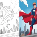
For a full demo of these techniques—including a look at how they transformed a drawing of Deadpool—be sure to watch the RTIFEX video below
Analogy: Think of your paper like a gravel road. If you just throw sand (pigment) straight down, it stays on top of the rocks. But if you brush it from every angle and add a little moisture, the sand fills every crack and crevice until the road looks perfectly smooth.