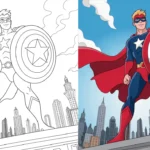
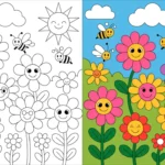
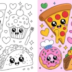
Rainbows never really go out of style. They just keep showing up in new ways. From colorful food trends to bold fashion and playful design, rainbow colors have a way of pulling us in and instantly lifting the mood. When everything feels a little dull, rainbows remind us how fun color can be.
If you’re craving bold, joyful energy in your coloring pages, rainbow-inspired palettes are the perfect place to start. Inspired by the classic ROY G. BIV spectrum, these nine palettes celebrate color in all its vibrant glory.
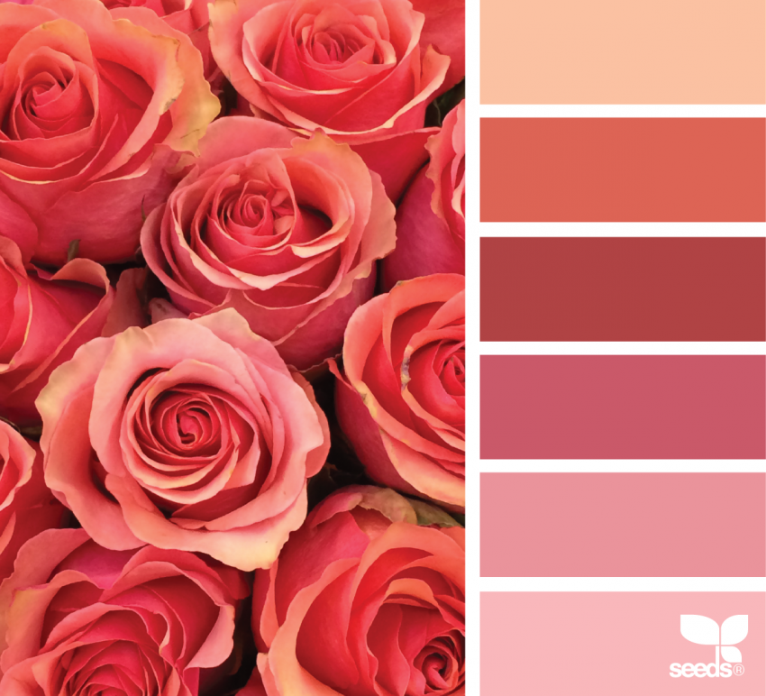
Rosey Reds
This palette explores red in all its personality, from soft blush tones to rich rose pinks. It feels warm, romantic, and expressive without being overpowering. Rosey reds work beautifully on floral designs, hearts, and any page where you want emotion and warmth to shine.
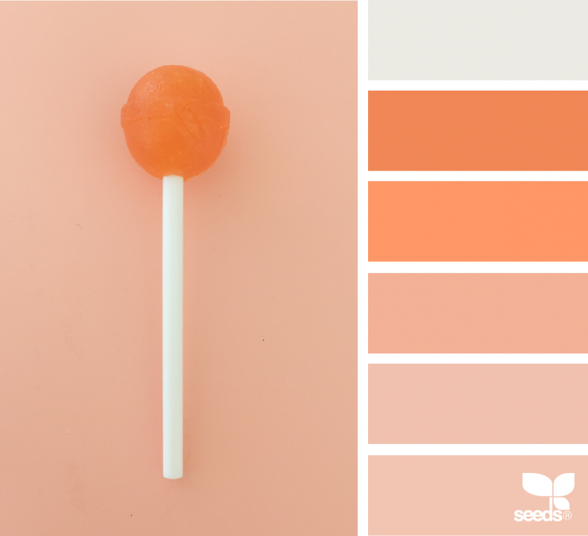
Suckers for Orange
Simple, cheerful shades of orange take center stage here. Paired with hints of yellow, this palette feels energetic and sunny, like a warm afternoon. It’s a great choice for uplifting designs, playful patterns, and pages that need a burst of brightness.
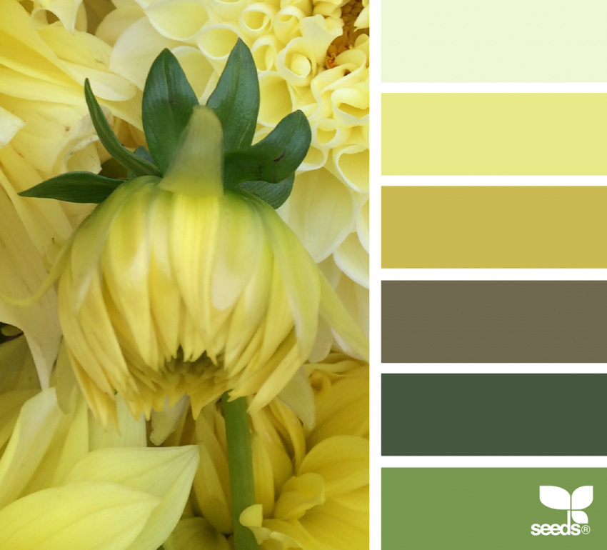
Say Hello to Yellow
Yellow has more range than most people expect, and this palette proves it. Soft buttery tones sit alongside bolder golden hues, balanced by a deep green that keeps everything grounded. It’s a fresh, happy combination that works especially well for nature-inspired designs.
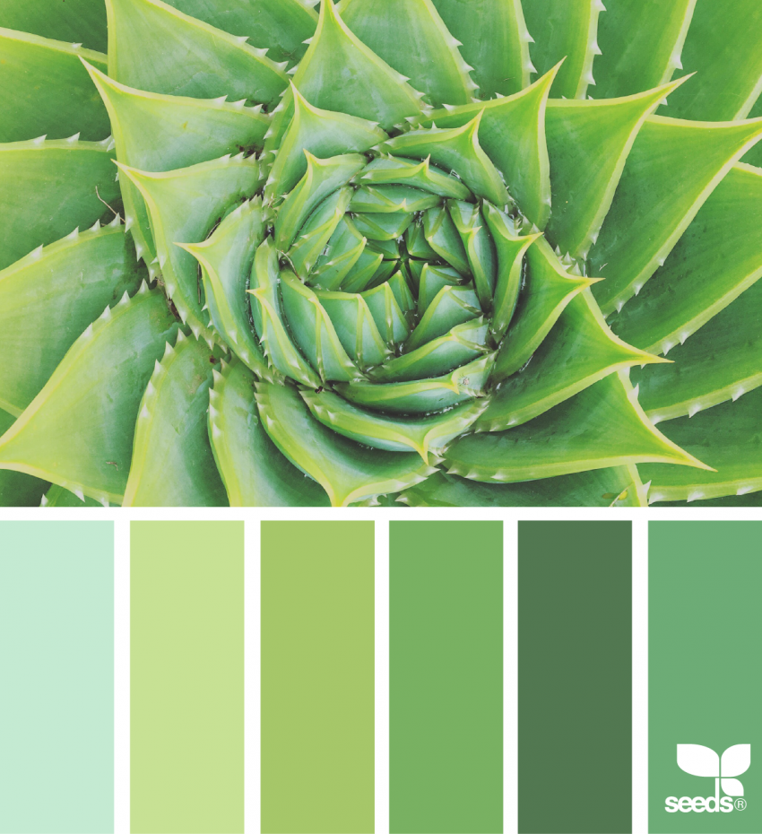
Goin’ Green
From deep forest green to fresh lime and soft mint, this palette feels calm and refreshing at the same time. It has a soothing, garden-like quality that’s perfect for plants, leaves, and outdoor scenes. These greens invite you to slow down and enjoy the process.
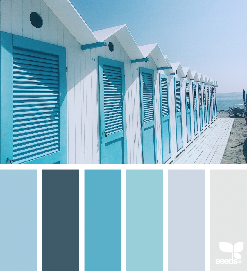
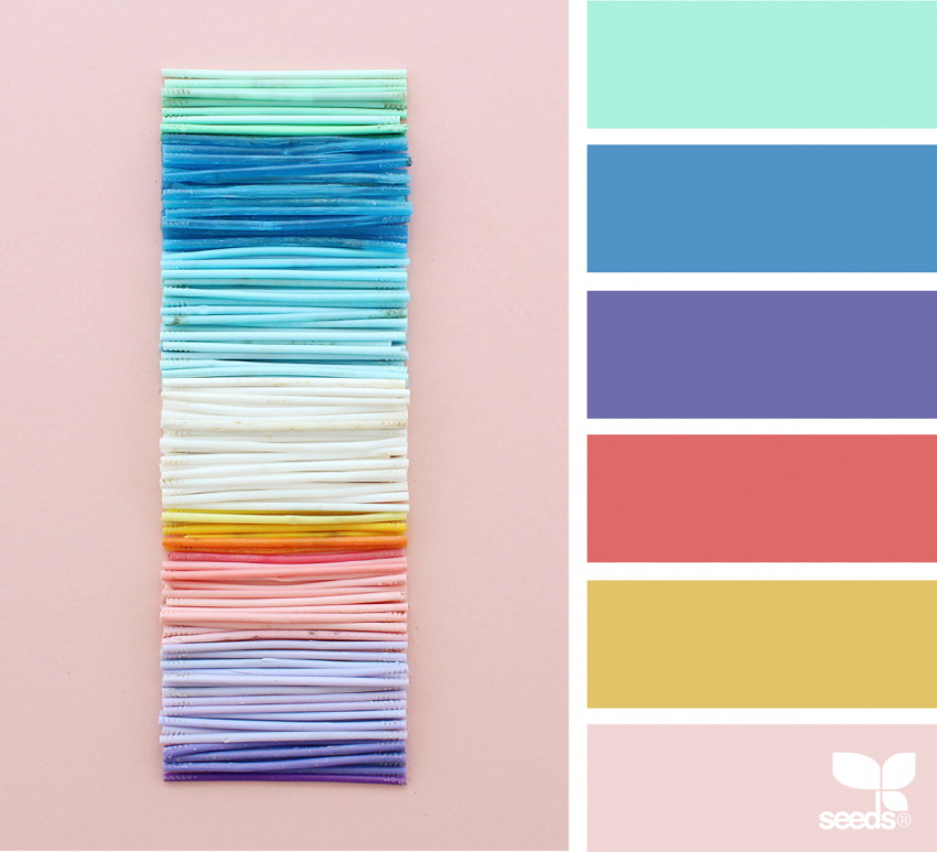
Beach Blue
This palette moves effortlessly through shades of blue, from pale, almost grayish tones to rich turquoise. It feels open, cool, and expansive, like staring out at the ocean. These blues are ideal for water-themed pages, abstract patterns, or anything that needs a sense of calm.
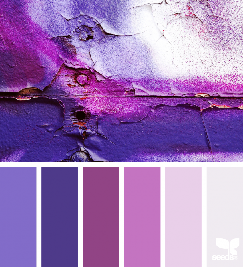
Color Me Purple
Purple is one of the most versatile colors, and this palette embraces that fully. Light lavender blends into deeper, more dramatic shades, creating a look that’s bold yet elegant. It works beautifully on florals, mandalas, and decorative designs where you want color to feel rich and expressive.
Chasing Rainbows
Sometimes the best inspiration comes from unexpected places. This palette pulls together the full rainbow spectrum in a way that feels playful and creative. Bright yellows, bold blues, and deep purples come together to create a true rainbow effect that’s perfect for mandalas and abstract designs.
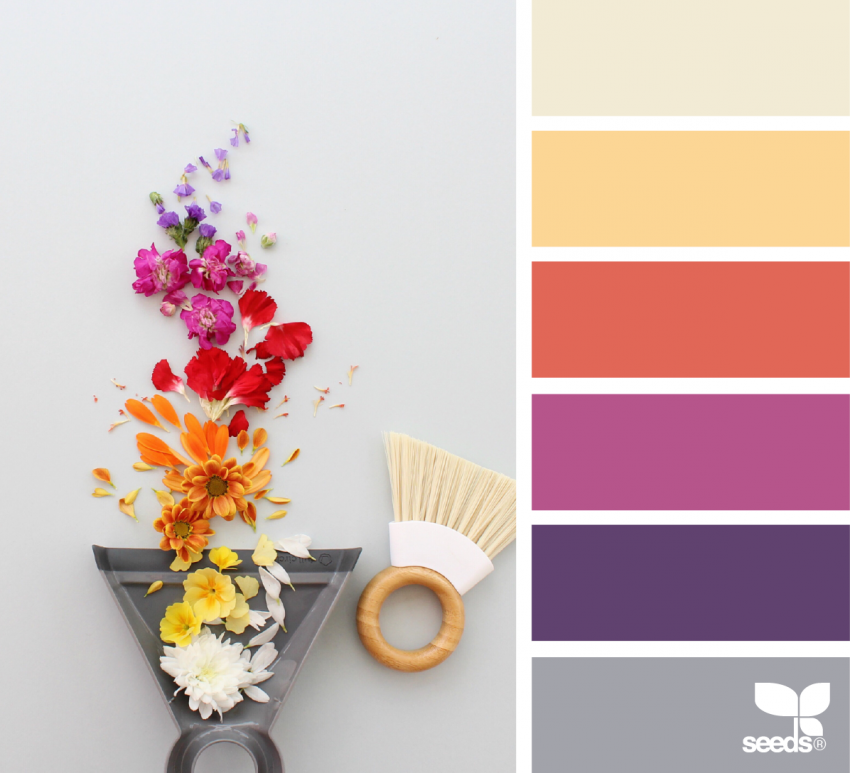
Rainbow Swept
This palette leans warm and fiery, blending deep purples into glowing yellows. The transition between colors feels dynamic and full of movement, like light sweeping across a page. It’s a great choice when you want your coloring to feel energetic and bold.
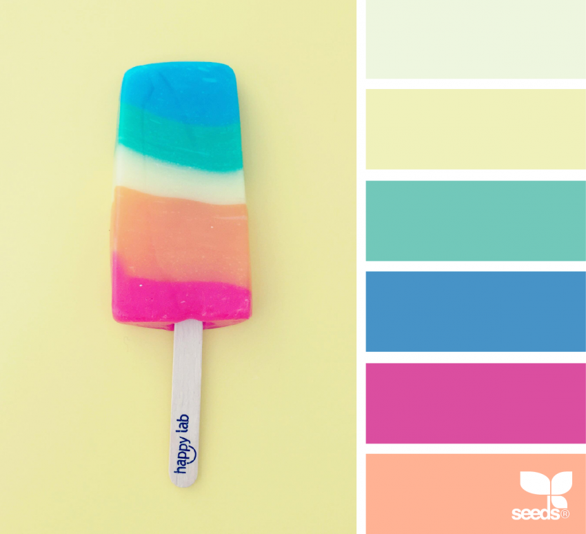
Chilled Rainbow
Soft peach, seafoam green, and pops of bright pink create a rainbow palette that feels fun and refreshing. Inspired by frozen treats and summer vibes, this combination is playful without being overwhelming. It works especially well for whimsical designs and fantasy-themed pages.
Final Thoughts
Rainbow palettes are all about joy, freedom, and creativity. There’s no wrong way to use them. You can follow the spectrum closely or pick and choose the shades that speak to you most.
Whenever your coloring feels stuck or uninspired, reach for the rainbow. A little extra color can go a long way in bringing a page to life.