Christmas coloring is all about mood. Cozy nights. Twinkling lights. Evergreen branches. Warm reds, soft neutrals, and the kind of colors that instantly make a page feel festive.
Whether you love classic Christmas shades or prefer something softer and more modern, the right color palette can completely change how your coloring page feels. To help spark some holiday inspiration, here are 12 Christmas color palettes that work beautifully for seasonal coloring pages of all styles.
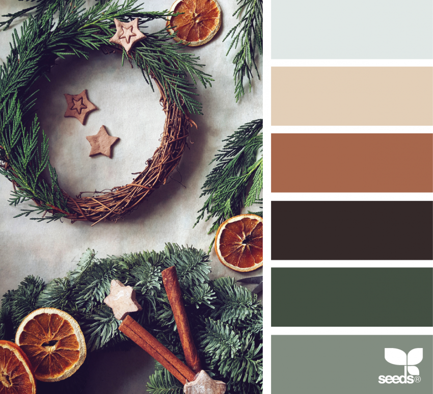
1. Wreath Ready
Burnt sienna, forest green, and deep brown come together in a palette that feels like late fall slipping into winter. It’s rich, natural, and perfect for wreaths, garlands, and botanical designs.
2. Snowy Summit
Soft whites and cool grays create that quiet, snowy morning feeling. Add pops of traditional red and green, and you’ve got a palette that feels clean, festive, and timeless. Ideal for snowflakes, winter scenes, and holiday patterns.

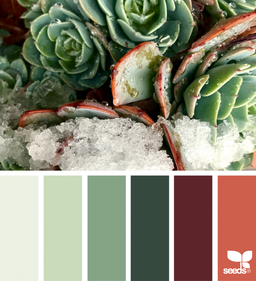
3. Holiday Succulents
Blush reds paired with strong greens give this palette a fresh, modern Christmas feel. Inspired by winter succulents, it’s a fun option if you want something festive without going fully traditional.
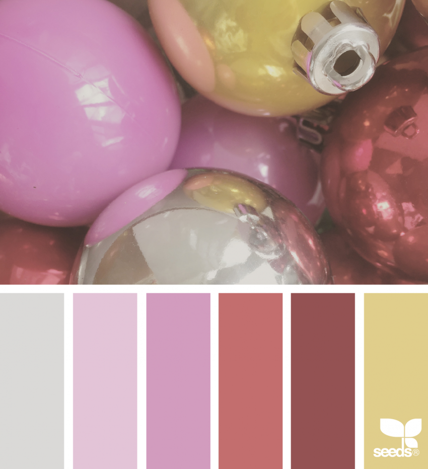
4. Cheerful Ornaments
Bright pinks and golden yellows bring playful energy to Christmas coloring. This palette feels joyful and unexpected, perfect for ornaments, decorative patterns, and bold designs that don’t take themselves too seriously.
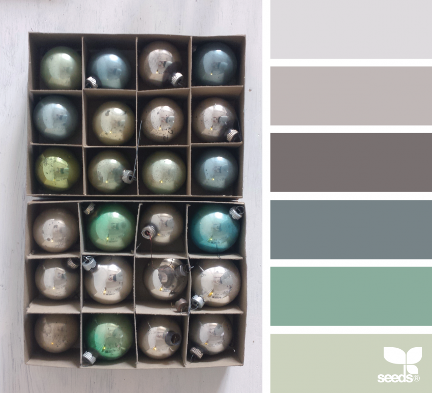
5. Festive Decorations
Cool grays mixed with soft greens give off vintage holiday vibes. This palette feels nostalgic and elegant, making it a great choice for wreaths, ornaments, and classic Christmas illustrations.
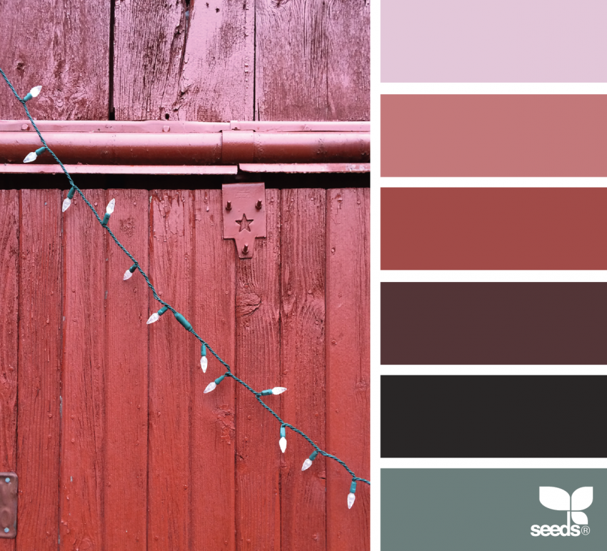
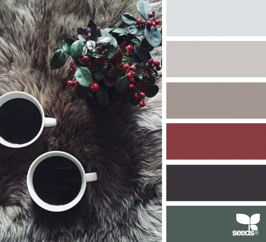
6. Red Barn Hues
A range of deep reds paired with silvery green creates a bold yet grounded palette. Add touches of dark brown or near-black for contrast, and this one really shines on poinsettias and traditional holiday florals.
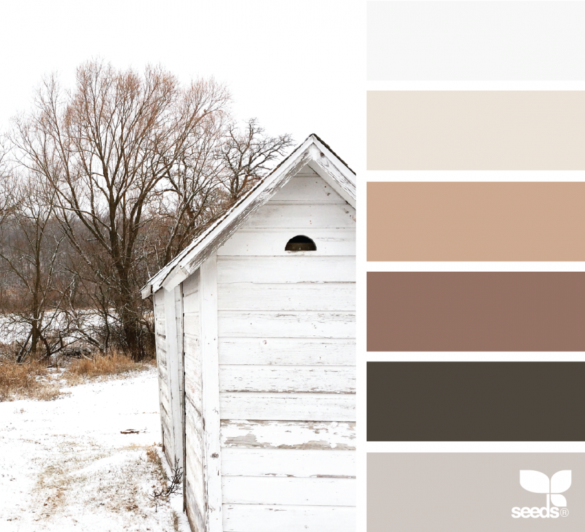
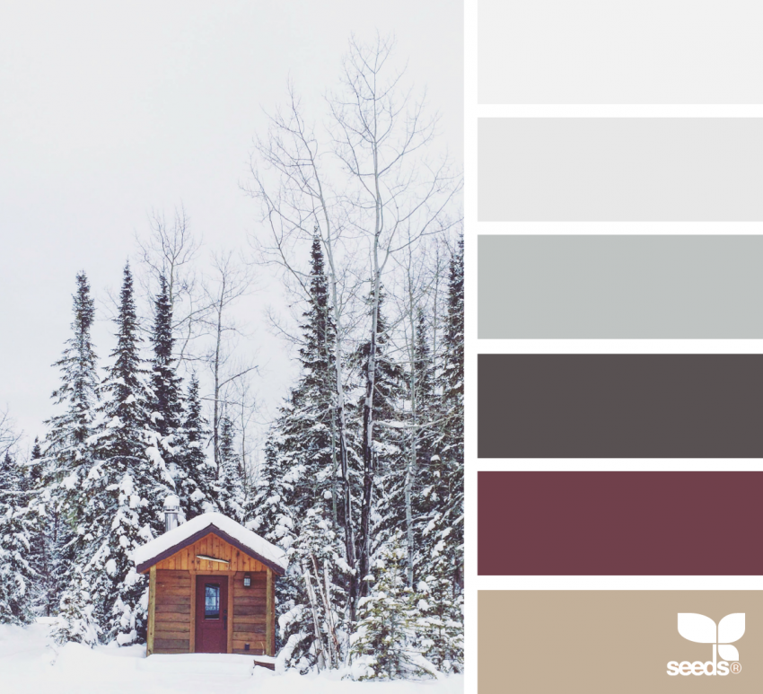
7. Rustic Winter
Earthy neutrals like pale gray, bark brown, and soft cream capture the quiet beauty of winter landscapes. When paired with gentle greens, this palette feels calm, cozy, and perfect for rustic Christmas scenes.
8. Warm Comforts
This balanced mix of red and green softened with tan and gray feels like a cozy holiday evening. It’s inviting and familiar, making it a great all-purpose palette for seasonal designs.
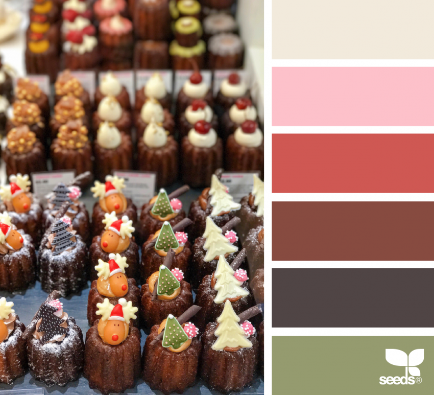
9. Holiday Treats & Sweets
Pink, chestnut brown, olive green, and soft neutrals come together in a playful, eclectic palette. It’s perfect for Christmas florals, candy-inspired designs, and pages that lean whimsical and fun.
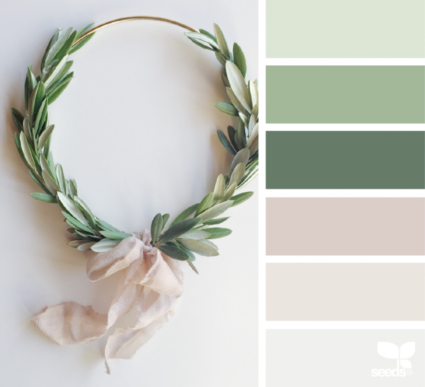
10. Pure Christmas Hues
Simple, clean, and elegant. Soft greens paired with warm beige create a minimalist Christmas palette that feels calm and classy. This one works beautifully for home-themed designs and decorative pages.
11. Winter Wonderland
Deep forest greens, crisp whites, and a bold red accent capture the magic of a snowy holiday scene. This palette feels straight out of a Christmas storybook and works especially well for patterned designs.
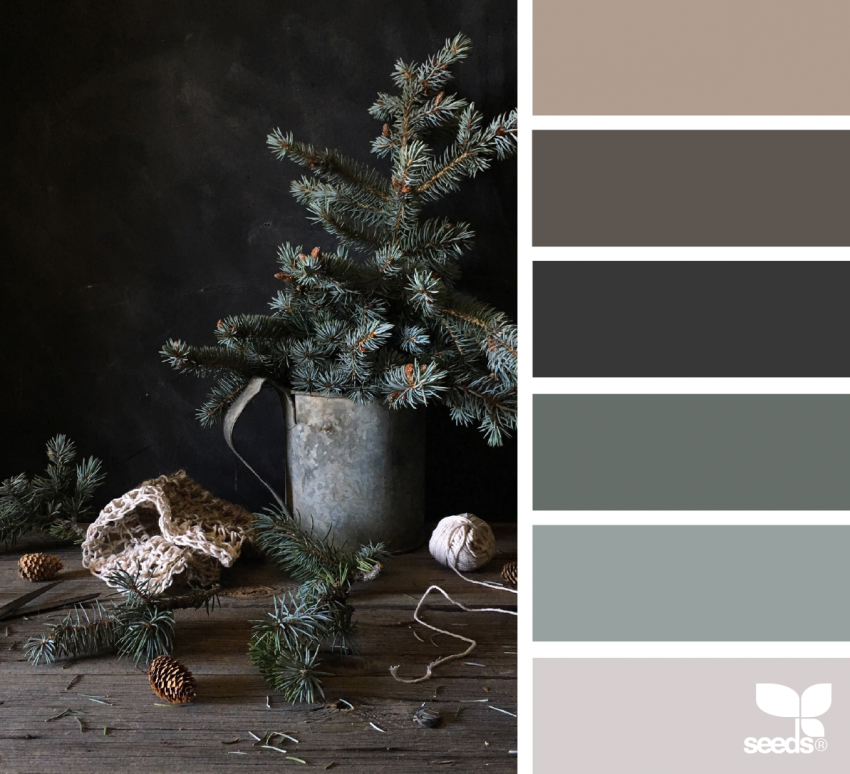
12. Seasonal Pine Trees
Muted greens, soft grays, and gentle neutrals create a moody, peaceful palette inspired by winter forests. It’s subtle and sophisticated, perfect if you prefer a quieter holiday look.
Final Thoughts
Christmas color palettes don’t have to follow strict rules. Use these combinations as a starting point, then adjust them to fit your style. Add extra sparkle, soften the tones, or mix palettes together to create something uniquely yours.
Most of all, have fun with it. Coloring during the holidays is about slowing down, getting cozy, and enjoying the season one color at a time.