Whether you’re packing for a warm getaway or staying home and wishing you were somewhere sunny, color has a funny way of changing your mood. When everything outside feels gray and cold, bright tropical palettes can bring a little escape right to your coloring pages.
These color combinations are perfect for spring break week, staycations, or anytime you want your coloring to feel light, warm, and joyful. Think beaches, sunsets, palm trees, and clear blue water.
Here are 11 tropical color palettes to inspire your next coloring session.
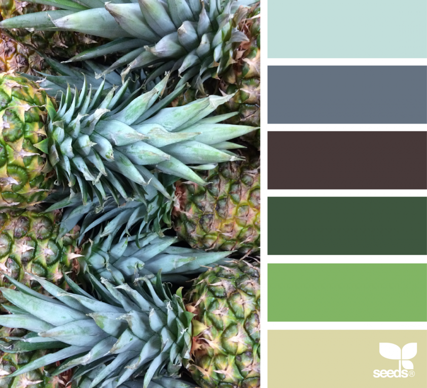
1. Pineapple Pulchritude
Bright greens mixed with cool blues make this palette feel fresh and playful. It’s bold without being overwhelming and works beautifully on patterns, geometric pages, or tropical fruit designs. If you’re coloring anything with leaves or repeating shapes, this one shines.
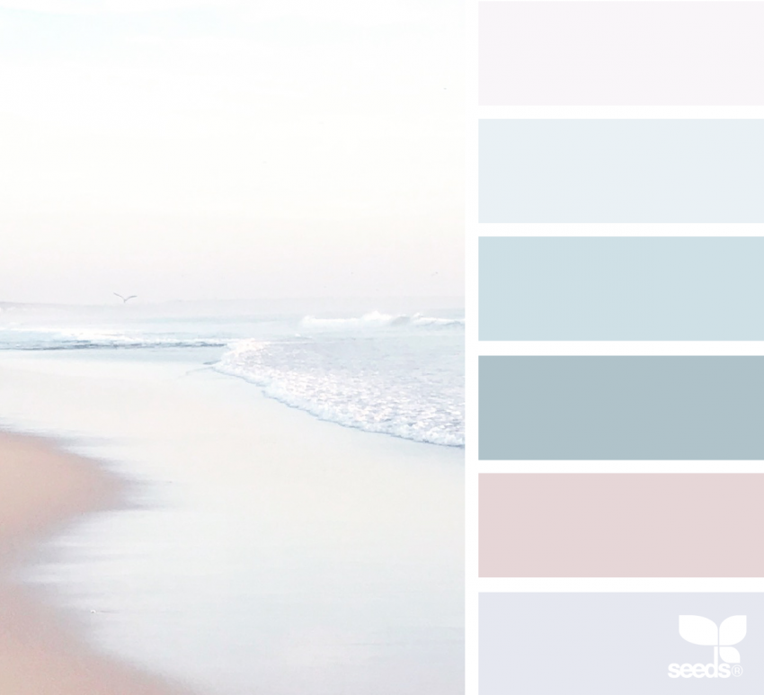
2. Calming Coast
Soft blues, pale purples, and gentle pinks instantly feel like a quiet beach morning. This palette is perfect for mandalas or slow, relaxing coloring sessions when you want to unwind and keep things peaceful.
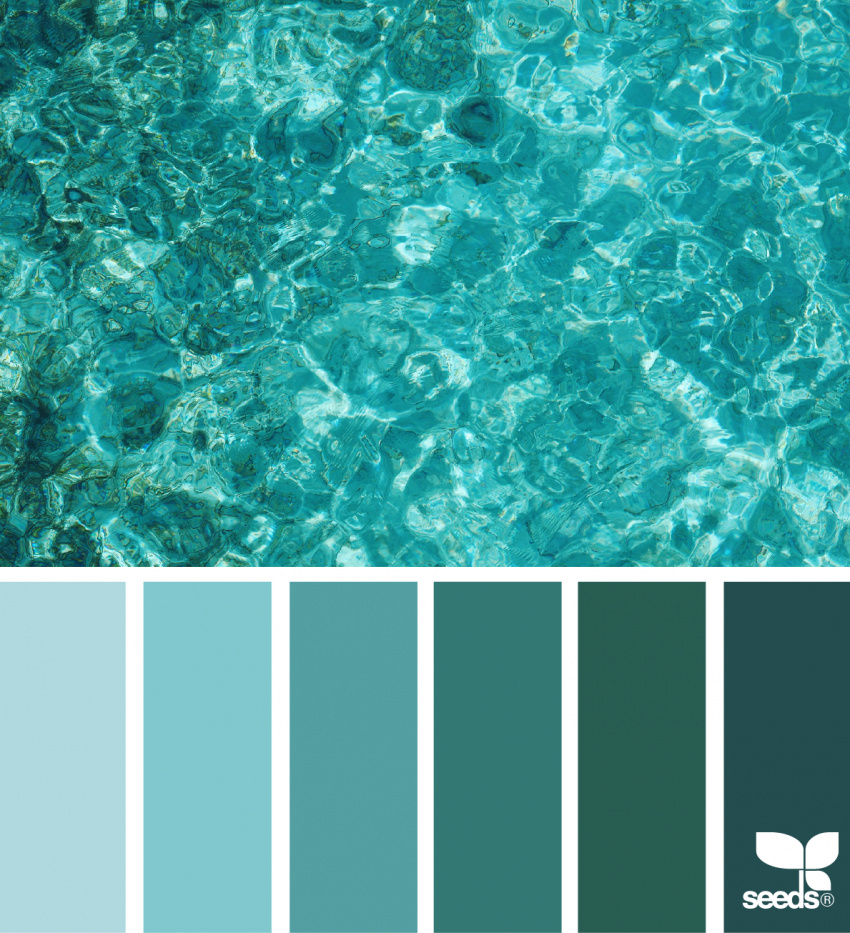
3. Totally Teal
Teal in all its shades feels like the ocean on a perfect day. From light blue-green to deeper turquoise, this palette is ideal for sea life, waves, or any beach themed coloring page. It’s soothing but still full of life.
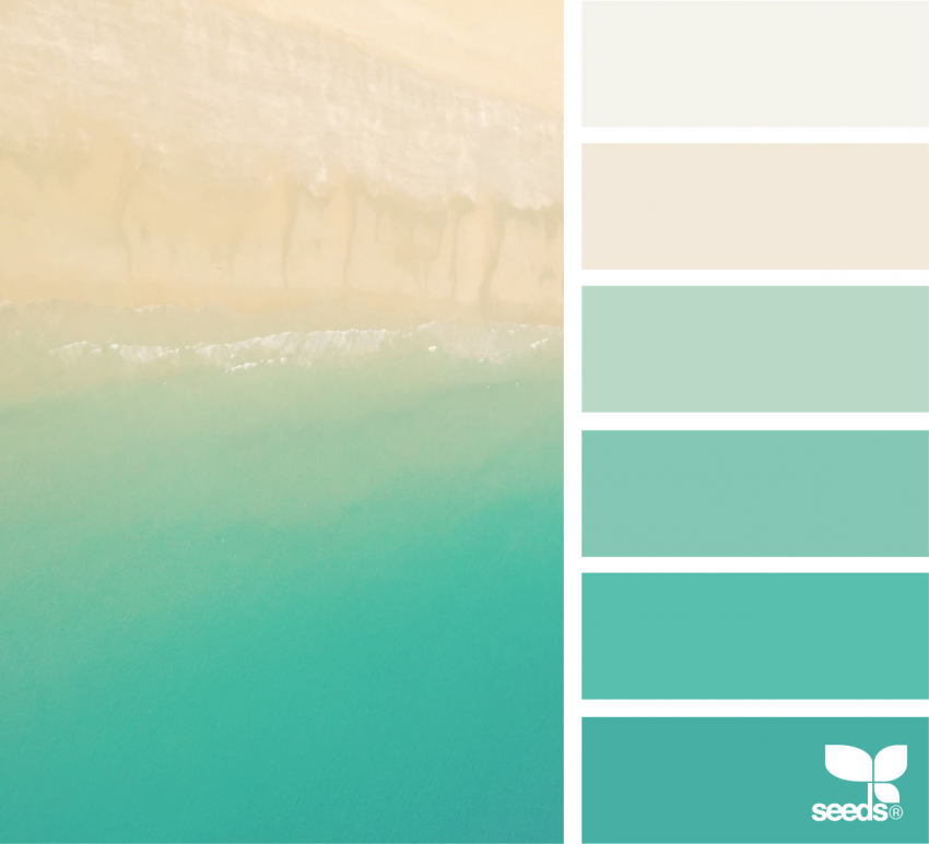
4. Perfectly Pristine
This palette fades from sandy neutrals into deep aqua tones, creating a clean and balanced look. It’s a great choice if you like subtle transitions and smooth blending without super bright colors.
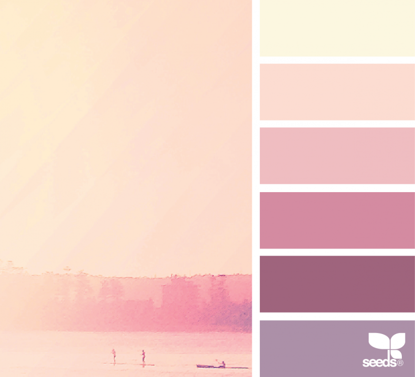
5. Sunrise to Sunset
Peach, pink, and soft purple capture those magical moments when the sky changes color. This palette works beautifully for flowers, skies, and nature scenes. It adds warmth and emotion without feeling too intense.
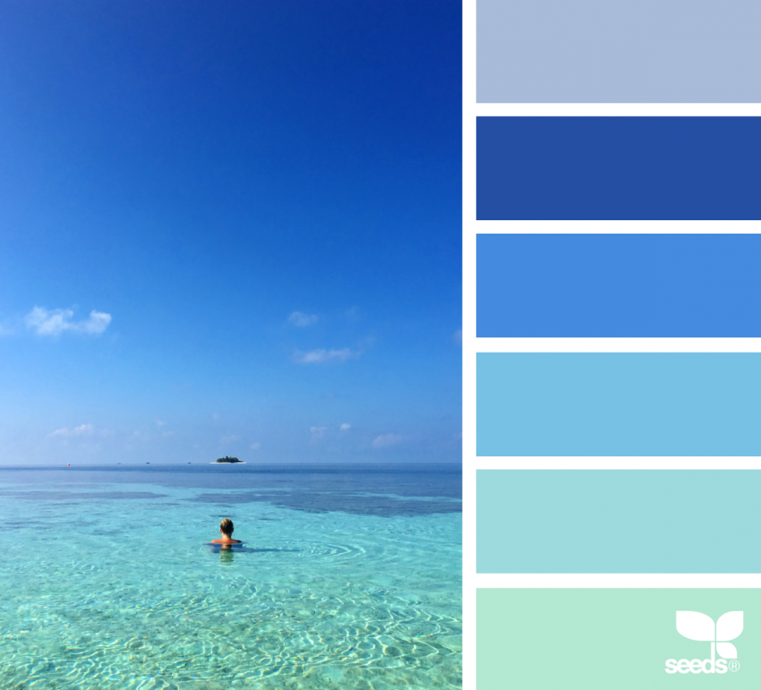
6. Maldive Madness
Clear blues and turquoise tones make this palette feel like floating in crystal clear water. It’s perfect for ocean scenes or any design where you want that fresh, breezy island vibe.
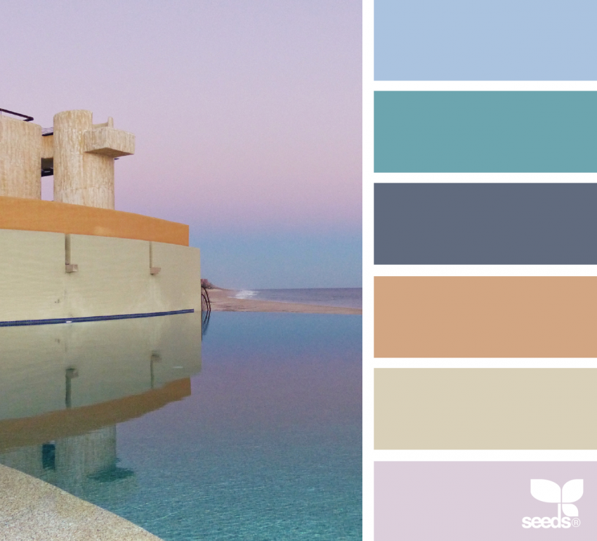
7. Cabo Color
This palette mixes sunset pinks, calm blues, and earthy neutrals. It feels relaxed but lively at the same time. Use it on architecture, travel themed pages, or scenes with buildings and landscapes.
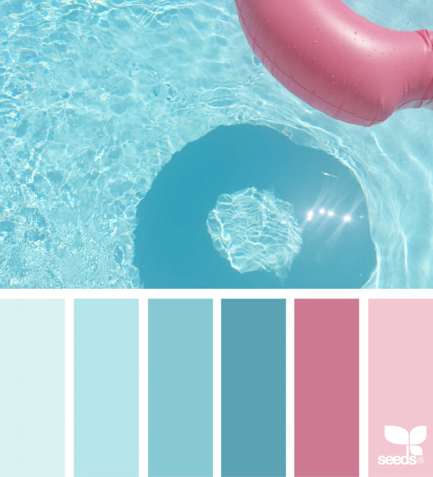
8. Floaty Fun
Bright pinks and blues bring poolside energy to life. This palette feels playful and fun, making it a great choice for whimsical designs, summer scenes, or lighthearted coloring pages.
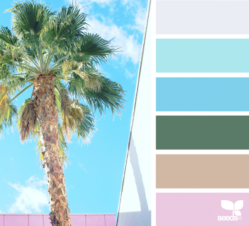
9. Pink and Palm
Palm trees and pink skies are a classic tropical combo. This palette feels cheerful and retro, perfect for desert scenes, florals, or anything inspired by warm-weather getaways.
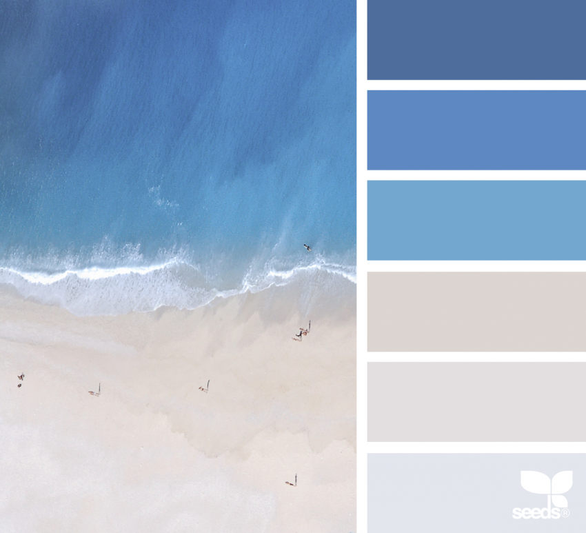
10. Deep Blue Sea
Rich blues paired with soft sandy tones create a dramatic but calming palette. It’s ideal for underwater scenes, ocean patterns, or any design where you want depth and contrast.
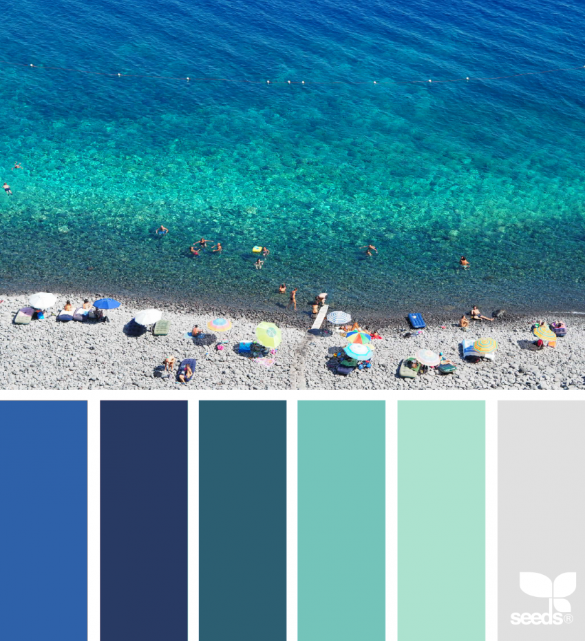
11. Idyllic Italia
Soft blues, stone neutrals, and muted coastal tones make this palette feel timeless and dreamy. It’s perfect for seaside towns, travel inspired pages, or detailed illustrations where you want a relaxed, elegant look.
Final Thoughts
You don’t need a plane ticket to feel a little sunshine. Sometimes all it takes is the right mix of colors.
These tropical palettes are a great way to refresh your coloring routine, lift your mood, and bring a hint of spring break energy into your day. Pick one that matches your mood, grab your favorite coloring tools, and let color do the rest.